
- Early Life: Born in Adelaide, South Australia, in 1921, Jeffrey Smart showed early artistic talent. He studied at the South Australian School of Arts and Crafts before moving to London in 1947, where he attended the Anglo-French Art Centre.
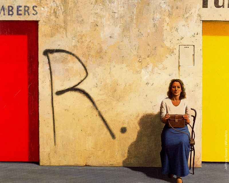
- Artistic Style: Smart’s style is characterized by precise lines, geometric shapes, and a focus on the man-made environment. His urban landscapes often depict highways, buildings, and infrastructure with a meticulous attention to detail. His paintings are known for their almost surreal, dreamlike quality.
- Influence of Metaphysical Painting: Smart was influenced by the Italian Metaphysical painters, particularly Giorgio de Chirico. This influence is evident in Smart’s use of sharp lines, dramatic shadows, and the creation of a sense of ambiguity and mystery within everyday scenes.
- Subjects and Themes: Smart’s paintings often feature industrial scenes, highways, and cities. He found inspiration in the modern urban landscape, presenting a unique perspective on the relationship between people and the built environment. His works evoke a sense of isolation and contemplation.
- Return to Australia: In 1963, Smart returned to Australia after spending several years in Italy. Despite his international experiences, he continued to paint urban scenes inspired by his homeland, showcasing a blend of European and Australian influences.
- Recognition and Awards: Jeffrey Smart received numerous awards throughout his career, including the Australian Creative Arts Fellowship for Painting in 1965 and the Australian Artist of the Year award in 1999. His works are part of major collections, both in Australia and internationally.
- Legacy: Smart’s impact on Australian art is significant. His unique interpretation of the urban landscape and his ability to infuse ordinary scenes with a sense of surrealism have influenced subsequent generations of artists. His works continue to be celebrated for their precision and thought-provoking nature.
- Notable Works: Some of Smart’s notable works include “The Cahill Expressway” (1962), “The Listeners” (1969), and “Study for Portrait of John Brack” (1969), all of which reflect his distinctive style and thematic concerns.
Jeffrey Smart’s legacy extends beyond his lifetime, and his contributions to Australian art have left an indelible mark. His ability to find beauty and intrigue in the urban landscape, combined with his unique visual language, has secured his place as one of Australia’s most celebrated painters.
Jeffrey Smart (Frank Jeffrey Edson Smart), AO (26 July 1921 – 20 June 2013) was an expatriate Australian painter known for his precisionist depictions of urban landscapes that are “full of private jokes and playful allusions”.
Jeffrey Smart was born and educated in Adelaide where he worked as an Art teacher. After departing for Europe in 1948 he studied in Paris at La Grande Chaumière, and later at the Académie Montmartre under Fernand Léger. He returned to Australia 1951, living in Sydney, and began exhibiting frequently in 1957. In 1963, he moved to Italy. After a successful exhibition in London, he bought a rural property called “Posticcia Nuova” near Arezzo in Tuscany. He resided there with his partner until his death.
His autobiography, Not Quite Straight, was published in 1996. A major retrospective of his works travelled around Australian art galleries 1999–2000.
Jeff Smart, as he was generally known for the first thirty years of his life, was born in Adelaide in 1921. He started drawing at an early age. “My parents would give me large sheets of paper, often the backs of posters or calendars … anything”. He was educated at Pulteney Grammar School and Unley High School, and originally wanted to become an architect.
However, after studying at the Adelaide Teachers College and the South Australian School of Art and Crafts in 1937–1941, he taught art in schools for the South Australian Education Department in 1942–1947. In the early 1940s he accompanied local maritime artist, John Giles, in painting industrial landscapes at Port Adelaide. He joined the Royal South Australian Society of Arts around 1941 and was elected vice-president in 1950. It was during this period that he acknowledged his homosexuality.

Jeffrey Smart

Jeffrey Smart

Jeffrey Smart

Jeffrey Smart

Jeffrey Smart

Jeffrey Smart

Jeffrey Smart

Jeffrey Smart

Jeffrey Smart

Jeffrey Smart

Jeffrey Smart

Jeffrey Smart

Jeffrey Smart

Jeffrey Smart

Jeffrey Smart

Jeffrey Smart

Jeffrey Smart

Jeffrey Smart

Jeffrey Smart

Jeffrey Smart

Jeffrey Smart

Jeffrey Smart

Jeffrey Smart

Jeffrey Smart

Jeffrey Smart

Jeffrey Smart

Jeffrey Smart

Jeffrey Smart

Jeffrey Smart

Jeffrey Smart

Jeffrey Smart

Jeffrey Smart

Jeffrey Smart

Jeffrey Smart

Jeffrey Smart

Jeffrey Smart

Jeffrey Smart

Jeffrey Smart

Jeffrey Smart

Jeffrey Smart

Jeffrey Smart

Jeffrey Smart

Jeffrey Smart

Jeffrey Smart

Jeffrey Smart

Jeffrey Smart

Jeffrey Smart

Jeffrey Smart

Jeffrey Smart

Jeffrey Smart
In 1951, Jeffrey Smart moved to Sydney and spent the next 2 years there as an art critic for the Daily Telegraph (1952–54), an arts compere called Phidias for the ABC children’s radio programme The Argonauts, and a drawing teacher at the National Art School (1956–62). From 1956 to 1962, he also presented on ABC-TV’s Children’s Hour. Smart was also employed by The King’s School, Parramatta in 1954–56 as an Art teacher, following Jean Bellette (known as Mrs Haefliger) and John Passmore. He exhibited throughout this period at the Macquarie Galleries.
Jeffrey Smart departed Australia for London on the Castel Felice out of Sydney just after Christmas 1963, driving to Greece with fellow painter Justin O’Brien. In 1965 he returned to Italy, and lived there for the rest of his life, regarding himself as an “Australian living abroad” and carrying an Australian passport. His last work, “Labyrinth”, was completed in 2011, at which point he announced his retirement.
Smart died of renal failure in Arezzo on 20 June 2013, aged 91.
Jeffrey Smart is one of Australia’s best known artists with his almost iconic and unique imagery, heavily influenced by various artists and art forms. His stark portrayals of contemporary life, both realistic and absurd, have been the basis of many artistic discussions. Critics and admirers of Smart’s paintings often debate his subject matter but in interviews Smart has preferred not to discuss his style; “Leaving the interpretation as the prerogative of the individual viewer.”
Smart states that he “paints a picture because he likes the shape”, and when asked why his skies are always so gloomy and smog-laden or why his faces never wear a smile, he claims “I need a dark sky for the composition, because pale blue at the top of a frame looks nothing … [and] because a smiling face is too hard to paint”.
Jeffrey Smart’s unsentimental paintings encompass lonely urban vistas that seem both disturbing and threatening. Isolated individuals seem lost in industrial wastelands, full of high rise construction, concrete street-scapes and an eerie feeling of harmony and equilibrium – where silence and stillness create a deathly ambience.
‘The express rape of the landscape’ is one title hanging over Smart’s paintings, referring to the freeways, street signs, trucks, oil drums, containers, buildings and concrete dividers that are the ever-present subjects of his work. At the same time his paintings – full of bold colours and perfect symmetry – are beautiful. The repetition of road signs in his works, for example, suggest an inconclusive direction and a world outside the frame is tantalising suggested.
Figures are present in many of Smart’s paintings. These are said to be “impassive observers, reconciled to the contemporary state of things, prepared to accommodate themselves to an increasingly impersonal environment” or as “statements on the dehumanising conformity of modern architecture and social painting”.
According to Jeffrey Smart however, “the truth is I put figures in mainly for scale”. It is Smart’s precise and unequalled attention to clean lines, composition and geometrics that make his eye-catching paintings stand-out “in the story of modern Australian art”. “The subject matter is only the hinge that opens the door, the hook on which hangs a coat. My only concern is putting the right shapes in the right colours in the right places. It is always the geometry”.
Under the tutorship lessons of modernist artist, Dorrit Black, Smart acquainted himself with the ‘Golden Mean.’ Also referred to as ‘the golden ratio’, ‘the divine proportion’, ‘the mean of Phidias’ and a number of other names, it has been used since ancient Greek times in many works of art and architecture. The golden mean is a geometric proportion, the ratio of which is approximately 1:1.618.
This complex network of interlocking rectangles, triangles and diagonal lines, is used to calculate the structure of Smart’s paintings, which form the basis of all his artworks. For Smart, geometry and precision of the composition is the key to successful art, much like how comedic timing is the key to the effectiveness of a punch line. “Today’s most prevalent myth is that Smart’s work has no content: that everything is a compositional exercise devoted to capturing a formal ideal of beauty”.
Smart’s surrealism
Smart’s paintings have been referred to as ‘surreal’, but Smart contended that it was the modern urban world that was surreal and not his depictions of it. “I find myself moved by man in his new violent environment. I want to paint this explicitly and beautifully … only very recently have artists again started to comment on their real surroundings”.
Some critics[who?] have argued that Smart’s work comments on modern urban alienation, a post-industrial landscape that has fallen from human control. Others have cast him as a realist, hyper-realist, ‘off-beat classicalist’ and a metaphysical painter. Some critics have even referred to Smart’s paintings as portraying ‘Orwellian gloom'[who?] – a statement referring, in particular, to George Orwell’s literary political masterpiece, Nineteen Eighty-Four.
James Gleeson believes that Smart’s paintings are “too real to be real”; and believes that his realist portrayals of 20th century life are nothing more than superb geometrical compositions and bold colour, of man in his naturalistic, man-made environment.
It is true, for instance, that trees are rarely seen in Jeffrey Smart’s artworks, and the only grass is that growing between concrete stones, but as Smart claimed: “an artist has to be moved to move his viewers”, and Smart was moved by man in nature – man-made nature – not concerned with your typical Australian landscape. “I like living in the 20th century – to me the world has never been more beautiful.
I am trying to paint the real world I live in, as beautifully as I can with my own eyes … It’s obvious a bunch of flowers or a billabong is beautiful, and I love natural beauty, but I am not moved by it. … to me composition is everything”. Smart believed that people should view art with their eyes and not their head.
Influences
Smart’s paintings may seem to visit an untouched area of art, but he has been influenced by other artists and art forms, especially from classical ancient art through his travels. An interest in architecture took Smart to Egypt, Greece, Turkey, Italy and Yemen. This Mediterranean journey led to the purchase of a three-hundred-year-old villa in Arezzo, Italy where he lived for the rest of his long life. It had in fact, always been an early goal for Smart was to become an architect; he was trained as a draftsman and sometimes considered himself in some ways a frustrated architect.
Piero della Francesca, a Renaissance painter and mathematician, was one of classical influences on Smart’s work. Smart said that seeing Piero’s works was “like falling in love” His favorite of Piero’s paintings was The Flagellation of Christ. He shared with Piero, in addition to the geometrics and composition, the spatial grandeur and ‘ineloquence’ found present in each of their works. He was also influenced by Renaissance Dutch painter Rogier van der Weyden. Despite Smart’s identification with the ancient art and architecture of the renaissance period, he likes to be recognised as a contemporary artist, not a ‘classical revivalist’.
The two modernist realists who have had immense impact on Smart’s paintings, are Alex Colville and Edward Hopper. Like Smart, Hopper painted “Human beings’ values being swallowed by 20th century industrial society” and Hopper “shows that, even though communication and transportation have never been so accessible, the individual is somehow left behind in the rush”. In his work, Hopper focuses on “eerily realistic depictions of solitude in contemporary American life”, works of similar appearance to Smart’s. Like Hopper’s, Smart’s paintings have been compared to Post-war Italian movie stills of the 1950s and sixties – where beauty is poetically captured in the ‘humdrum’ Italian cities. Alex Colville painted desolate landscape settings with lonely characters, and used much the same geometric underpinning and bold colours.
Technique
Smart regarded being able to draw the human being as the single most important attainment of any artist. When asked why none of the people in his pictures are ever painted smiling, he said that he could not draw smiles well. Unlike many primarily landscape artists, he could paint both the human form and the human face, as can be seen in his self-portrait work. He regarded abstract painters as people who never learnt to draw.
Smart mostly painted with oil, acrylic and watercolours, generally using the bold primary colours – yellow, blue and red – and dark greys for his skies. This created an unusual effect in his works as the foregrounds of his paintings are fully lit despite the dark sky. His process of painting was a long and arduous one, resulting in barely a dozen finished canvases a year. “I always do a lot of preliminary drawings, moving the forms, the shadows, the buildings the figures around the canvas till I get that perfect composition …”
Much of Smart’s direct artistic stimulation came from, literally, a passing glance as he was driving: “My paintings have their origins in a passing glance”. “Sometimes I’ll drive around for months … despair, nothing, nothing, then suddenly I will see something that seizes me: a shape, a combination of shapes, a play of light or shadows and I send up a prayer because I know I have the gem of a picture.”
Source: Wikipedia
Jeffrey Smart was an extremely well-travelled artist. His many road trips as a passenger (he did not drive) provided him with the opportunity to scan urban and suburban landscapes looking for strange juxtapositions, unusual events and odd placements.
Such metropolitan vignettes were collected by Smart’s artistic mind and carefully arranged into compositions in his studio/home Posticcia Nuovo near Arezzo in Italy’s Tuscany region. His compositions were always consciously arranged and then constantly rearranged until they achieve the balanced pictorial structure and ‘open-ended’ ambience that characterise all his major paintings, such as Near Pisa of 1995.
Jeffery Smart was only eighteen years of age when his talent was fully recognised. In 1939, Smart was invited to participate in Adelaide’s first exhibition of modern art. The group exhibition, organised by Mary P. Harris (1891-1978), was called ‘The Testament of Beauty’ and included the works of much older artists such as David Dallwitz (1914-2003), Ivor Francis (1906-1993), Jacqueline Hick (1919-2004) and Douglas Roberts (1919-1976), amongst others.
Five years later, in 1944, Smart held his first solo exhibition at Kozminsky’s, the famous Melbourne institution. Robert Menzies, later to become Australia’s longest serving Prime Minister, opened the exhibition; Clive Turnbull, the insightful art critic for Melbourne’s Herald newspaper, wrote a favourable review. Smart’s direction was set. Subsequently, he traveled to Paris in 1950 and studied at the Grande Chaumière School, one of the best art schools in Europe – artists such as Alexander Calder (1988-1976), Alberto Giacometti (1901-1966), Amedeo Modigliani (1884-1920) and Isamu Noguchi (1904-1988) passed through its doors.
He also attended the Académie Montmatre where for a time he worked under the famous French artist Fernand Léger (1881-1955), whose highly accomplished painting China Town of 1943, was successfully auctioned by Menzies in June 2015.
Smart’s work is represented in every State Gallery in Australia as well the National Gallery of Australia and numerous national and international private and University collections. Furthermore, Smart held forty solo exhibitions, participated in fifty-five group exhibitions, been represented in sixty survey exhibitions, written twelve publications and is cited in over 350 books, journals, newspapers, interviews and films, both nationally and internationally. Such was his artistic standing that, in 1999, the Art Gallery of New South Wales mounted a large and highly successful retrospective of Smart’s paintings, which travelled to the Art Gallery of South Australia, the Queensland Art Gallery and the Museum of Modern Art at Heide.
It is worth noting that all of Smart’s paintings are of the real and observed world – they arise from lived experience and acute perception. Smart did not invent them, dream them or dredge them up from his unconscious. This is, in part, why one is drawn to them; these images exist in a familiar world. We all have seen such scenes and glimpsed such vignettes, but do little or nothing with them. By contrast, Smart noticed them with the eye of an artist and re-presented them in ways that highlight their integral mystery and visual power – always, the ordinary is transformed in the extraordinary.
Most good artists have highly developed and sophisticated visual literacy and Smart’s language of artistic form is instructed by a simple and abiding aim. As he put it: ‘I find myself moved by man in his new violent environment. I want to paint this explicitly and beautifully’.1 By ‘violent’, Smart here means urban and metropolitan environments that are far from the peaceful and unperturbed comforts of small villages, farms, vineyards and pastoral locations. Just such poetic sentiments underlie the pensive sensations found in Smart’s paintings. They invariably portray scenes where technology and ‘progress’ dominate and threaten to overcome human beings – so often in Smart’s paintings people sit, stand, walk and work in strangely alienating and dehumanising locations.
Like most serious artists Smart was understandably reluctant to discuss or explain his paintings however in 1968, writing for the prestigious Swiss journal Art International, he gave a rare glimpse into the enigmatic and varied content of the personal world of his metaphysical and aesthetic ruminations:
Some styles have become outmoded for the artist’s message. (If he has a message). But how would Bonnard paint a Hilton Hotel bathroom? How wrong a jet-plane or a modern car looks painted impressionistically! A man is logical in horseback; but in a satellite, surreal. Only very recently have artists again started to comment on their real surroundings. New art movements emerge ever faster.
Now for the first time since 1874 (First Impressionist Exhibition) a painter may employ any style, and not be labelled reactionary. We accept changes and miraculous discoveries without wonder – as Vermeer handled a white jug; but man has changed little in thousands of years in his need for art, even for mysticism. He still strives for the same ends, in different ways. Security? The Bomb? How much more insecure Fra Angelico must have felt riding to Orvieto with the threat of outlaws, robbers and the plague.
Many of Smart’s scenes are seen as though perceived through a car window. Smart paintings are depend upon wandering and travel; one views these exterior scenes as though hermetically sealed from them – yet, Smart’s artistic vision was never cold or sardonic; by contrast, he was always dispassionate yet gentle in his observations.
Smart employed what might be called an observational aesthetic. As a consequence, Smart’s briefly perceived glimpses invest his paintings with a temporary ambience as though the painted scene is captured in the blink of an eye while being isolated and removed from it. These qualities have led some commentators to discern a filmic quality in Smart’s paintings and to see parallels in the films of the Italian Post-War films of Michelangelo Antonioni (1912-2007) and Federico Fellini (1920-1993), where beauty is also sought within the constructed confines of metropolitan realities.
Furthermore, the early films of the German director Wim Wenders (born 1945) present many scenes through a car’s front window to focus and frame viewers’ attention and to experience the film scenes subjectively, that is, like the film’s subjects.
In Smart’s paintings there is that same sense of seeing the world through the artist’s eyes. Smart was not simply an impassive observer of urban realities; he was an active and avid collector and a manipulator of carefully selected visual details that channel one’s vision and construct pictorial meaning. All of them, Antonioni, Fellini, Wenders, would have recognised Smart’s aesthetic aims and been able to distinguish the hidden poetry behind his urban-based visuality.3 Smart puts these aesthetic aims both cryptically and incisively in the following faltering words:
Sometimes I’ll drive around for months. Despair: nothing, nothing. Then suddenly I will see something that seizes me. A shape, a combination of shapes, a play of light or shadows, and I send up a prayer because I now have the germ of a picture. I have to stop and record that inspirational flash immediately, or I might lose it. I make rapid sketches, take photographs, note the time of day in case I want to return. …To recrystallise a moment of ecstasy: ecstasy or a moment or a feeling about something. Sometimes the feeling is not so much visual. Sometimes it’s a feeling about a certain place or area of Rome or Florence, or the country where there’s a garage. There a feeling there that I like. (author’s italics) 4
Smart’s accomplished Near Pisa of 1995 is a mature aesthetic reflection on a theme that he revisited at various points in his life. The painting presents his signature pictorial ‘silence’ where figures are placed in compositions that seem unhurried in atmosphere as well as eerie in ambience. In Smart’s Near Pisa, the pictorial setting is made up of a roadside scene with three workers in yellow and red overalls.
There is a ‘separateness’ about the figures as though they exist in their own worlds and the painting does not hint at any deeper connection between them. This gives the artistic composition an unsettling disjuncture that suits its dehumanised setting. For instance, the present painting’s almost square format frames a scene that is treeless and bland with blocks of apartments that are at the extreme end of Italy’s image as a touristic haven. As well, the road signs reflect Smart’s constant interest in geometry and visual balance and seem to concentrate the viewer’s attention and magnify the effects of the commonplace.
Smart has managed to combine an inspired personal landscape of mental associations with the thoughts of the inner self in ways that give his painting its poetic content and characteristically bracing psychological tension.
The present painting condenses much as Smart’s vignettes are both confronting in their vivid realism and comforting in their recognition of familiar urban realities. In making the familiar so unfamiliar Smart reminds one of the potential erosion of humanist values. We all sigh when we recognise the ubiquitous commonness of Smart’s urban realities and thus are brought to share in his ironic vision of urban compromises. It is the mysterious blending of such complex, even conflicting, sensations that make Smart’s paintings so unique and memorable.
No other artist in Australia has captured such evocative content so precisely and opened one’s eyes to the taken for granted harshness of the incongruities of industrialisation and municipal development.
Footnotes
1. Smart, Jeffrey, Art International, vol.XII/5, Zürich, May, 1968. Cited in: McDonald, J., Jeffrey Smart: Paintings of the 70s and 80s, Sydney, Craftsman House, 1990, p.50
and Pearce, B., Jeffrey Smart, The Beagle Press, Sydney, 2005, p.153
2. Ibid
3. These points are taken up more fully in John McDonald’s scholarly study: see Ibid, pp.28-29
4. Smart in Pearce, B., Jeffery Smart, The Beagle Press, Sydney, 2005, p.8
Literature
Pearce, B., Jeffrey Smart, The Beagle Press, Sydney, 2005
Capon, E., Jeffrey Smart Retrospective, Sydney, Art Gallery of New South Wales, 1999
McDonald, J., Jeffrey Smart: Paintings of the 70s and 80s, Sydney, Craftsman House, 1990
Quartermaine, P., Jeffrey Smart, Melbourne, Gryphon Books, 1983
Smart, J., Not Quite Straight, Heinemann, Melbourne, 1996
Associate Professor Ken Wach
Dip. Art; T.T.T.C.; Fellowship RMIT; MA; PhD,
Emeritus Principal Research Fellow and
Head of the School of Creative Arts,
The University of Melbourne
Source: By Ken Wach in Blog
Whenever Jeffrey Smart has returned to Australia from Italy his visits have been something of a cultural phenomenon: devotees fall into line and arts editors suspend critical reason. Smart is fond of saying his paintings don’t mean anything profound, of quickly dismissing our overactive imaginations, as though we have unnecessarily taken his colour-by-numbers formalism for something deeper. Or do we already get his deadpan conundrums and expect there must be more?
Perhaps we should simply take him at his word. There are, of course, occasions when we shouldn’t trust an artist’s spoken introspection; many feel uncomfortable talking about their work and will offer awkward and forced snippets. But Smart, ever the dandy ringmaster of creative mystery, seems happy when he’s in town to indulge gatherings of aficionados and journalists, many of whom seek and indeed find the emptiness of the human condition in his imagery of stark urban isolation. Smart pulls them into line; he humours them, politely belittling them with his explanations that this colour, this shape creates a balance with that shape, those colours, in pursuit of the perfect composition.
If he’s right, and the paintings don’t mean much, is he playing some kind of Wildean or Whistler-like gag? It seems not. Smart’s visual one-liners appear to be an argument for sameness – he’s certainly good at it. Those paintings with gloomy skies hold all the drama of an airport novel’s cover, a genre that knows its market. He is happy for his work to be used to illustrate the failure of current-day art schools and undisciplined youthful endeavour. He studied with Fernand Léger (1881–1955) and thinks the day will come when his teacher will be more highly regarded than Picasso. Indeed, he decries style-changing Picasso as a destabilising influence for younger artists with a propensity to experiment.
The primacy of drawing: that’s something Smart would agree with. If you’re a realist, representation is important. There are good drawings by Smart and they’re mostly from the 1940s and ’50s. The later pencil-of-darkness works with their scratchy forms seem consumed by the frustration of an architect with design block. In their unrelenting and laboured repetitiveness, the lines suggest the artist’s lack of desire to imagine anything other than what he’s done before – a civic realism devoid of any sense of human uneasiness or illusory anxiety.
There’s no painterly drawing, nor painting that seeks to emphasise the drawn form: everything seems utterly predestined, as though the lot might be gridded up and handed to studio assistants for infilling. Smart’s mid-career and mature paintings don’t excite thinking or wonderment; their plastic surfaces seem devoid of any personal touch. The familiar and tedious sweep of his sable brush, the unvarying bend of grass in a non-existent wind: why would you want to paint each grass stalk if most are going to look the same? These are mere grass carpets on which figures are placed. The figures themselves appear as bored models. Isn’t the point of realism to allow us to see the subtleties, the syntax, and to intensify our perception and experience?
Smart says he only paints what interests and excites him, that long periods elapse before the ideas crystallise and fully form. But this colour, that shape – signs, arrows, road lines – it’s obvious and stiff, like a new realist academician going through his paces.
Smart’s distinctive style formed in the 1960s when his realism became sharper, and the contrast of pictorial elements more accentuated. Although his works of the 1940s and ’50s seem much more complex and genuine through their use of texture, half-tones and colourful incidents, they never had the sophistication of the paintings of a much less celebrated artist, Eric Thake (1904–82). Thake’s paintings, including his surrealist-like imagery as a war artist, reveal a keen and inventive eye and distinctive imagination. Take Archaeopteryx, 1941 (Art Gallery NSW) and Brownout, 1942 (National Gallery of Australia): the latter is a masterpiece of formal design and menacing ambience.
The 1970s and ’80s saw Smart consolidate the contrived compositions with their polyurethane figures, as well as his use of colour: those raw primaries, the cadmiums. Smart is interested in colour and yet, at his most garish, he allows them to look as though they’ve been squeezed straight from the tube. Predictable colours that jump out from inky half-tones or variations in beige look more like a languid routine at work where any sense of invention dissipates as he reaches into his formalist box of tricks. The figures just exist – collaged – without imparting any sense that they’re playing out some larger human schema.
There are times when it seems there is a game being played – some subtle cheek, perhaps. The studies, for example, never seem to lead into the work but, oddly, look like incidents after the fact. These vignettes are stylistic affectations, right down to the deliberately sketchy borders, which have been painted to mark them as studies, to suggest a certain pause before the artist abandons them and moves on to bigger things: Old Master pretentiousness, a nod to the greatness of others.
While Smart enjoys attention, his mordacity is legendary. He has described Sidney Nolan as a “bogus” painter, “an exponent who just wanted to make some money”, and has been no less disparaging of John Brack and Fred Williams. Yet Brack, Nolan and Williams shaped the way we see Australia. They represent both a sophisticated and vernacular iconography that has and will endure. Is it possible to think of these three ever slipping from any account of Australian art in the second half of the twentieth century?
And what about Smart, then? His Cahill Expressway, 1962 (National Gallery of Victoria) is well known. It’s also a marker of where his descent began. If Smart moved abroad to further his career, nothing came of it. He has had solo exhibitions in London and Rome, but only in Australia have people paid attention to him.
That Smart is well known but unimportant is precisely the problem with the Australian canon. It’s too often subject to uncritical esteem. Striking but clunky compositions became Smart’s mainstay. Take his large commission, Container Train in Landscape, 1983–84, in the Victorian Arts Centre. It’s the kind of arrangement that might be used as a lesson to aspire to something more inventive, something less patently prefabricated.
I think, too, of cheesy iconographic nationalism and later works by Albert Tucker, his gnarled explorers’ heads being attacked by parrots. Of course, no amount of revisionist or scholarly reinterpretation is likely to quickly shift public perception. To dissent is rather like joining a queue to kick Skippy. But it is important to say these things because there are many Australian artists – great artists – who reject pomposity and pretention, who have remained ignored.
*
‘Master of Stillness: Jeffrey Smart paintings 1940–2011’ opens at Adelaide’s Anne & Gordon Samstag Museum of Art on 11 October.
source: DOUG HALL
Doug Hall is a former director of the Queensland Art Gallery and Australian Commissioner at the Venice Biennale.
View Jeffrey Smart Painting